

BLOG
Considering a New Mobile Website? Here’s What You Need to Know Before You Start
 LINKEDIN
 FACEBOOK
 TWITTER
 INSTAGRAM
It’s official: Mobile searches have overtaken desktop searches in 10 countries, including the U.S. and Japan. The rapidly expanding mobile-first search world has led Google (with Bing not far behind) to tweak its algorithm to favor mobile optimized sites for search rankings – the so-called “Mobilegeddon.” The message is clear: As users and search engines favor searches on-the-go, Google is committed to providing an optimal mobile experience and neglecting mobile could mean the inevitable – loss of search rankings and eventual loss of new business.
As a savvy business owner you probably know that having a mobile website experience is important for search rankings. But it is important to carefully craft a mobile strategy that is performance-driven and responsive to your consumers’ on-the-go search behavior. So how should you navigate the mobile-first world? Before you decide to take a first-step to establish your mobile presence or are interested in evaluating your mobile presence, here are some useful mobility guidelines:
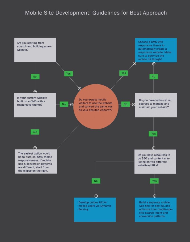
Mobile Configurations
If you have explored mobility solutions, you have probably heard that there are three different configuration approaches to build a mobile presence:
- Responsive Design
- Dynamic Serving
- Separate URL
Responsive Design has become the holy grail of mobile site development where content from the main website is resized and repositioned to best fit all screen and devices. Responsive Design, however, may not be the best option for you especially if you expect usage patterns and conversion paths to differ between your desktop and mobile users.
Dynamic Serving allows you to serve different user experience on the same URL, based on the type of device that’s requesting the page, thus creating a mobile UX relevant to your on-the-go customers. Use the Vary: User Agent HTTP header for pages that serve dynamic content based on device or that redirect to device-specific URLs to signal to search engines that website content will change based on user agent (device) that requests it.
Separate Mobile site is a great option to create a completely different mobile site and host it on different URL to deliver a highly specific mobile user experience and optimize for mobile search intent. The mobile URL can be a subdomain (m.domain.com), a subfolder (www.domain.com/mobile) or an entirely different domain (www.mobile.com).
So which configuration is best for you? Click to download
Task-Centric Site – Before you decide which approach is best for you, understand your target audience and their mobile behavior patterns. Consider tasks they are most likely to perform on your mobile website and design the site to ease smartphone task performance.
Understanding their behavior will not only help you create relevant UX, design and content but will also affect the method you use to build a mobile site. If there are significantly different use patterns on a mobile and desktop site, consider a Dynamic Serving website that can render a completely different UX under the same URL. Having the same URL also means you save on SEO costs, although you can tailor the mobile page content for some mobile search intent. A separate mobile site will also work well to serve different use patterns of customers, but entails significantly more technical and marketing resources.
Website content – Is your website content heavy? Will your customers be served well by serving the same content to mobile users or do you want to restructure your site architecture to break a long, single page content into several pages? If it’s the latter consider developing a separate mobile site. Alternatively, if you choose the responsive approach, analyze whether the bandwidth-heavy content can be turned off for responsive mobile sites.
Technology – Mobile specific web pages provide the ability to integrate specific properties of mobile devices that can be used to improve user experience. For instance, the ability to tap in geo-location, cameras and phone can vastly improve user experience. Think Chase mobile site and app that facilitates online deposits by taking pictures of checks, or the ease with which Shutterstock’s customers can click and upload pictures to create personalized cards and stationary, or Google mobile site that uses geolocation to find the best Mexican restaurant near you, if that’s your search intent! Whichever method you use to create a mobile experience, make sure you use the best of mobile technology mapped out against your user needs.
Search Intent – Are your mobile users looking you up with an intent to perform tasks that are different from your desktop visitors’ tasks? If yes, responsive design may not be the best option for you. While a Dynamic Serving site will allow you to optimize the on-page content and layout to target specific keywords, a separate mobile site is the best way to go to aggressively target search intent through building quality backlinks for mobile-specific search words.
Ready to start creating optimal mobile experiences for your on-the-go audience?
Click to download our Friction-free mobile experience design checklist.
Contact us at info@webtage.com to schedule a FREE consultation on your mobile strategy.
About the Author
A believer in hype-free and performance driven digital strategies, Snigdha’s endeavor is to get your brand established and your business grow. She is passionate about research, design and analytics and works non-stop and meticulously to make sure that your brand stands out from the rest.
Snigdha’s background is in research design, industry research, content creation, and qualitative and quantitative research (including web-based and phone survey methods and focus group discussions). She is a highly qualified professional in the areas of digital marketing strategy design, SEO, content creation, and social media marketing. Most recently she has grown a client’s online presence from zero to 25% online leads within 3-6 months; moved client website to the #1 & #2 spots on Google, Bing, and Yahoo for all major keywords; and generated online leads accounting for 25% – 30% of all leads for that client.
Contact her at snigdha@webtage.com
Contact us for FREE 1 Hour Web Consultation
Schedule your free consultation today to discuss how our website technlogies sercices can benefit your enterprise.
Get in Touch